TBP: Home of the Brave

Monday, 30 June 2014

I should really back up all my photos so I don't have such a hard time looking for them...

Late last year, after taking me to WVRST, my boyfriend tried to prank me into thinking he was going to take me to the same place for another food adventure. He took me to the same street, headed in the same direction, so I almost thought he was going to be lame and take me to WVRST for the second time. Little did I expect for him to pull me in to a pub about two spaces before...


Home of the Brave is a pub that has a very hipster feel, similar to WVRST. Instead of a vibrant red backdrop wall however, their decor is a little more cozy. I'd have to attribute this partially to the overall colour scheme (neutrals of black, beige and chestnut), the lighting (brighter than WVRST but not completely hospital-kind-of-sterile either) and the clutteredness that is the pub (which is pretty much the centrepiece of the whole space). The branding added even more to the hipsterness that is this pub, as I looked onto their beer bottle:


Remember when I said hand drawn chalk typography is so big/in right now? That's what this brand reminded me of. But let's not get carried away with the atmosphere and the nitty gritty details that a designer would typical notice. We are here to relish in the sight of delicious food afterall...


Perhaps the knife staked in the middle of the burger may seem a little daunting in the first photo, but trust me, it's not that bad :P I didn't have this particular dish, no. My boyfriend being a big fan of fried chicken, couldn't resist the Kentucky Fried Handshake Sandwich. I found it a little comical that they would have a chicken leg sticking out like that. Maybe that's just me? Either way, my boyfriend enjoyed it, and that one bite I had from his burger, I enjoyed too.


We also shared a cute little saucepan of Tater Tots. There were about 11 or 12 of them? I don't remember. They weren't too greasy and they had the right amount of crisp. It was a shame that they didn't have more in one serving :(


Finally, I ordered the... you'll have to excuse my poor memory at the moment. It's a burger of barbecued beef but I can't seem to find it on their menu. Maybe they don't serve it anymore? :( Anyway, what I appreciated about this dish was that it wasn't too salty; it was sweet but not too sweet, and the meat was tender. Plus, the presentation made the burger even more appealing (and they didn't have a knife staked into the burger, haha). 

My only criticism is that, much like WVRST, Home of the Brave is a bit pricey for the quantity you get. The burgers average around $12-14 from what I could muster in my memory, and mind you, these burgers were not that big. Their size is comparable to a regular burger at McDonald's (i.e. the Filet-O-Fish). Then again, you are paying more so for the quality if anything, since these burgers aren't what you would call typical fast food. 

Overall, I quite enjoyed my time there, and for someone like me, the burger and the appetizer was enough for me. Not sure about the heartier eaters out there though :P

.
.
.

Until next time!


Luis Suarez being signed onto Barcelona???

Lately...

Thursday, 26 June 2014

I've been, I've been losing sleep...


And now I feel like singing along with One Republic. Damnit that song gets me everytime.

Seriously though, my usual routine has been a little shaken up so despite the fact that I'm not lacking so much sleep, it kind of feels like I am : /

So I apologize if my blogging schedule is not quite as routine as it usually would be. Going into my 2nd week in a new job, I'm still slowly adjusting to the many new faces, commute, responsibilities, and time. Not only that, I've had enough extracurricular events, favors and tasks to do that I'm a little mentally and emotionally overwhelmed. I should be okay though. *crosses fingers*

In the meantime, I hope to be able to write a tbp during the weekend to fill your visual senses and appetite on previous food adventures!

What I wish I could do everyday with the giant car line up turning right...

Tuesday, 24 June 2014


Only because I'm actually trying to turn left : /

Art Inspiration: Alexis Marcou

Monday, 23 June 2014

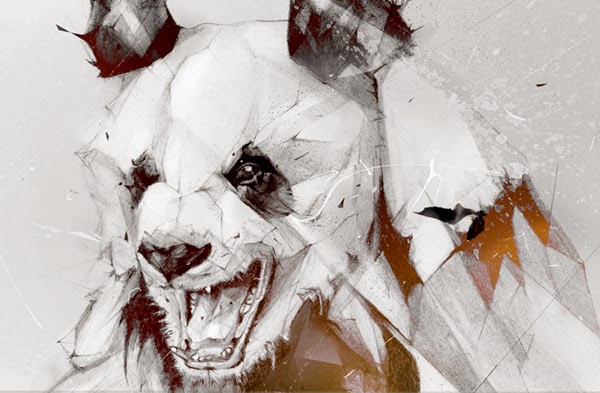
An illustrator that has worked for big names such as Nike and Hewlett Packard, Alexis Marcou has a distinct drawing style that is uniquely his own. His most notable works show a great sense of dynamism and motion (maybe drawing inspiration from Italian Futurism???) through the pose of the subject as well as the beautifully executed "disruptions" or fractal nature of the drawing. He kind of reminds me of another impactful inspirational figure that I've admired in my younger years — Pete Harrison. They both have a somewhat similar style, but the biggest difference is that Alexis' work is mostly done in pencil, with some digital refinement.


How I feel today...

BRB Watching the World Cup...

That Italian Place

Saturday, 14 June 2014

I don't go to Brampton often, but when I do, it's to eat some delicious food... lol.

It's been awhile since I had a food post, and my boyfriend has been meaning to take me to That Italian Place, so why not?


There wasn't anything particular about the decor that caught my eye. It wasn't fancy and it wasn't shabby. I did appreciate the generous amount of light that flooded the place though, because it made the food that much more aesthetically appetizing (not that it wasn't already)...


We both ordered fettucine — I had the Bolognese and he had the meatball version. His was essentially the same thing as mine, except his meat was in the form of the meatball, while I had meat that was evenly spread throughout the sauce. It was a good serving size (deceiving small!) and a bit on the pricey side (that plate was for $8, the same price you would pay at a Vanelli's at a food court and get an even bigger portion there) but I would justify it with the quality. The sauce clung to the pasta well (sometimes, I'd experience a place where the tomato sauce would just slice off the pasta and the pasta would have almost no retainment of the sauce whatsoever), and the texture of the fettucine was just how I liked it — not too soft but not completely al dente either.


Because the dishes were deceivingly small, my boyfriend thought a lunch sized plate of fettucine wouldn't fill him up. Midway through the meal, he ordered a panini for $9. Again, a little pricey, but the quality was worth it. I was a little thrown off by the size of the sandwich when it came in (maybe I haven't had enough paninis to know their standard size, haha), as it was in a bulky square shape. Although I only took a bite out of it (I was content with my portions, thank you!), that one bite was satiating enough. I liked that the bread wasn't too dry. The cheese wasn't too salty, yet it still had a subtle taste, the chicken wasn't salty either, and there was a healthy helping of lettuce. If I hadn't ordered my fettucine, I would have definitely wanted to try their paninis. Maybe next time? That is, if I actually happen to be in Brampton and need a place to eat?

While I would enjoy eating here, it is a little out of the way. Then again, most of the places I've blogged about so far aren't exactly within easy reach either, so there's that.

World Cup Starts today...

Thursday, 12 June 2014


Brazil Vs. Croatia

Legggooooo!

(please excuse my illiteracy as I'm clearly too excited at the moment)

Gentlemen's Dignity: My most common reactions

Design Inspiration: Dangerdust

Sunday, 8 June 2014

This was from awhile back, but I thought it would be cool to share regardless.

Chalkboard art has been all the rage these past few years as there has been a rise and renewed interest in the art of handlettering. Usually you would see delicate scripts, funky chicken scratch words or vintage inspired lettering. Today I bring you the marvellous works of Dangerdust, a duo from the Columbus College of Art and Design that has been anonymously invading classrooms and providing beautiful works to aspire to, on chalkboard tables.


I was amazed when I first laid eyes on the work they've done. It's not even the typography that gets to me — it's the mastery of the medium like none other that I have seen before. There is a whole other level of expertise with chalk evident here, especially in the first picture I showed. The subtle layering of the different chalk colours to achieve a complexity of blended colours and opacity was just... wow. I love making a good "space" picture but I would fathom that using chalk to make that would be even harder than Photoshop. 

If you want more of their typographic and chalkboard art goodness, you can always follow them on Instagram :)

Quick DIY: Crystal + Wrapped Wire Pendant Necklaces

Saturday, 7 June 2014


I've loved the look of quartz pendants ever since maybe two years ago, and have always been meaning to make one. Originally I was planning on ordering a few quartz pendants from Etsy (I might still do that sometime in the future?). Then I was rummaging through my room and found a couple of candidates to make my own for free :D

I basically followed the instructions from this video:


I'll admit, wrapping the wire around the rock was a bit difficult at first, possibly because of the wire I was using, or the way I was wrapping my wire... I don't know. I eventually got it to work though, which made my night.


.
.
.

Until next time!

Sitting, Waiting, Wishing

Tuesday, 3 June 2014

Unfortunately, I barely had time for myself during the weekend (hence why I'm sitting, waiting and wishing for a vacant day... har har). But when I did have even the littlest of time... I abused it by playing a puzzle game. How typical of Melody.


Anyway, I plan to have a side DIY soon (really simple and tons of people have done it, but I wanted one as well...), and another DIY IF I'm not bombarded by other social callings or mandatory tasks. I hope I'm not starting to sound like a hermit... lol