Showing posts with label Inspiration. Show all posts

Design inspiration: iamrader

Friday, 29 August 2014

Awhile ago, I was browsing through kinetic typography/motion graphic videos on vimeo and came across this little gem:


BBC KNOWLEDGE 60 from iamrader on Vimeo.
Even now, this video remains as one of my favorites. I loved how the animations flowed effortlessly from one concept/scenario to the next, how the aesthetic styling was minimal but quirky and whimsical with the extra texture detail here and there and the intricate detail in animation that added more dimension to the more simple look.

It's too bad I couldn't embed examples of his other work, but I found them visually riveting as well, especially his TV teasers for the BT TV platform. Iamrader (Mauro Rader) incorporated the brand colours throughout the teaser without being too blatantly obvious about it, and managed to convey the different facets of the platform (cool, serious, fun and playful) while staying consistent stylistically.

It's the end of the week, the end of the week, it's....

Friday, 18 July 2014

Wongfu Weekends!

Hahah I wish. I still have yet to meet those three extraordinarily talented individuals. *sigh* One day, one day.

Anyway, it is Friday, and not only is it something to look forward to because I don't have to scramble around my room to wear something work appropriate, but this weekend looks promising. Not that last weekend was any bad either, it's just that when I have a Summerlicious dinner to look forward to and possibly brunch with two friends (the closest co-workers I've had from my previous work) that I miss dearly, I can't help but smile at what's to come.

In the meantime, I shall share a couple of things I found inspirational, of which the first one is today's Google sketch. If you haven't seen it already, you should. It's a tribute to Nelson Mandela made from a series of illustrations. And I know that everyone knows at least a bit about him, but his words that were animated in this tribute were powerful and uplifting, reminding everyone that they should have the right to live peacefully, no matter what race they are. The animations were well paced, and the movement of the typography enticed me to keep clicking on the next button. It certainly leaves a good feeling to start the day with you know?

As for the second piece of inspiration, it comes in the form of this video:


I used to think Robin Thicke's Blurred Lines was done in absolutely poor taste, especially when I tend to associate the man with Miley Cyrus'  highly inappropriate performance for whatever award show it was that they were in. This video however, shed in some new light that isn't so bad. It also resonates with me because I tend to be a grammar Nazi, so I die every time I see a literary offense made. The worst would be the kinds that shouldn't even be made, the kind that is rudimentary spelling and grammar. It's not to say that I don't commit any "word crimes" at all; I just tend to be extra critical in nature because English wasn't my primary language, and I knew that I always had difficulty with tenses back in school. If there was someone who was even more grammar Nazi than I was and was willing to help me improve, I'd gladly accept their advice.

In the meantime, just enjoy the video, and hope you'll have a great weekend also :)


Art Inspiration: Alexis Marcou

Monday, 23 June 2014

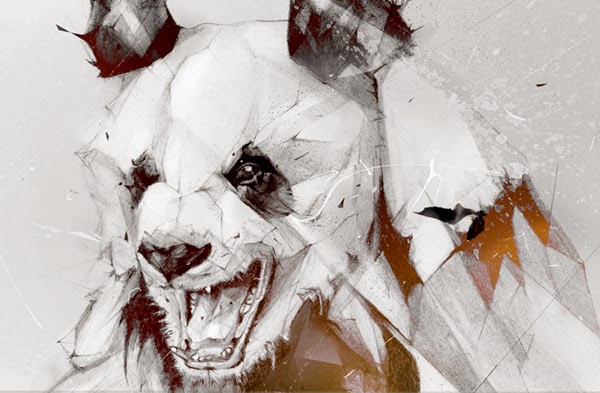
An illustrator that has worked for big names such as Nike and Hewlett Packard, Alexis Marcou has a distinct drawing style that is uniquely his own. His most notable works show a great sense of dynamism and motion (maybe drawing inspiration from Italian Futurism???) through the pose of the subject as well as the beautifully executed "disruptions" or fractal nature of the drawing. He kind of reminds me of another impactful inspirational figure that I've admired in my younger years — Pete Harrison. They both have a somewhat similar style, but the biggest difference is that Alexis' work is mostly done in pencil, with some digital refinement.


Design Inspiration: Dangerdust

Sunday, 8 June 2014

This was from awhile back, but I thought it would be cool to share regardless.

Chalkboard art has been all the rage these past few years as there has been a rise and renewed interest in the art of handlettering. Usually you would see delicate scripts, funky chicken scratch words or vintage inspired lettering. Today I bring you the marvellous works of Dangerdust, a duo from the Columbus College of Art and Design that has been anonymously invading classrooms and providing beautiful works to aspire to, on chalkboard tables.


I was amazed when I first laid eyes on the work they've done. It's not even the typography that gets to me — it's the mastery of the medium like none other that I have seen before. There is a whole other level of expertise with chalk evident here, especially in the first picture I showed. The subtle layering of the different chalk colours to achieve a complexity of blended colours and opacity was just... wow. I love making a good "space" picture but I would fathom that using chalk to make that would be even harder than Photoshop. 

If you want more of their typographic and chalkboard art goodness, you can always follow them on Instagram :)

Art Inspiration: Janko Pocuca

Wednesday, 19 March 2014

While doing visual research for my job, I came across a piece by Janko Pocuca. I had looked at maybe a dozen or so graffiti pieces that day on Behance.net (and mind you, they were very well done), but this particular artist stuck out to me the most.

Usually, when you think of graffiti, you think of crazy, sometimes incoherent lettering that just look like abstract forms. Or maybe you think of bubble letters, or lettering that is legible, accompanied by ornamental aesthetics such as spray splatters, slick illustrations and a plethora of colours. Pocuca's work isn't short of the latter, nope. The thing that made him oddly distinct from the other graffiti pieces I've seen that day however, is the sheer whimsicality of his work.

If you look at the select few pictures of his work below, you'll see what I mean. In a way, his illustrative style kind of reminds me of Ren and Stimpy (wooo 90's kids would probably know which cartoon this is, not that I watched this cartoon much), just with more pleasing aesthetics. His characters have this non-sensical silliness to it that you don't find in a lot of graffiti. Maybe I haven't seen too many renowned graffiti or something, but I always had the impression that most graffiti artists just want their work to look cool, to have some sort of social documentary to it, or they don't really have a meaning behind it. 

Anyway, here is some of Janko's stuff:


Design Inspiration: Joanna Behar

Friday, 14 February 2014

In the spirit of Valentine's Day, I share with you guys something I saw a few days ago (granted, I'm a year late, but whatever) to inspire my own valentines day card! I will post my own creation sometime soon, but for now, enjoy the witty/nerdy/geeky humour of the New York based designer, Joanna Behar in the form of her valentines day cards :)